If you don't know where your're going, how do you know when you get there?
This is my quandary with the pineapple blocks.
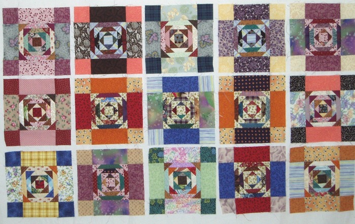
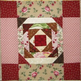
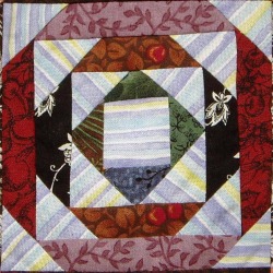
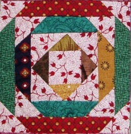
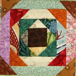
When I started this project, it was more like an experiment than a project. I just wanted to see what I might do with my 1-inch and 1 1/2-inch scrap strips. So I pulled out a set of yellow ones that I had in quantity, and made the first round of tiny pineapples. One thing led to another, and before long I had 30 of the little devils. To make them less devilish and small, I framed them with 2-inch strips and squares. That's 30 7-inch blocks.
Now what?
Since my 30 blocks were a combination of 12 with light corners and 18 with dark corners, that presented a design challenge to put them all together. I finally settled on 5 stacks of 6 blocks, with the 12 light corners on the outside and the dark corners in the center. Not ideal, but better than anything else I tried, and it had the virtue of simplicity. It wasn't what I would have planned, but then, I didn't plan, did I?
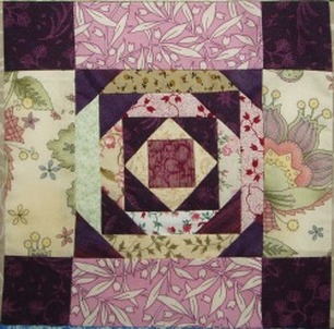
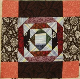
Even with the wider strips framing the pineapples, they were still very busy-looking blocks.
Not to mention that they still only added up to 30 x 35 inches.
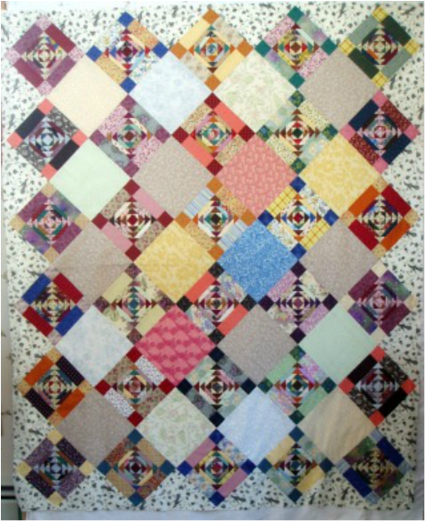
Solution: turn the blocks on-point and add alternate plain blocks. Perfect! I love how the corner triangles of the pineapples and the corner squares of the frames form "chains" across the quilt.
Finding the right fabrics for the alternate blocks turned out to be an interesting exercise. My scrap collection now includes a sizable stack of 7 1/2-inch squares, all the rejected candidates.
I discovered that, even with fabrics that are basically all one color, some prints are very busy, while some are exceedingly boring. Zoom in on that photo and you'll see what I mean.
Take that dark pink: busy. It isn't so much that there's a lot of pattern, but the value contrast within the print is rather bold. And the pale green? B-O-R-I-N-G. It's a tiny, fine print of two very close-valued shades.
Mixed all together, the alternate blocks finally achieved a balance. I also tried to balance the lighter and darker values by concentrating darker ones in a center diamond. Then I framed it all with an airy black & white print, for a complete change of texture.
It still isn't finished, though at this point I'm not sure what will come next. I'm thinking of a series of borders. Maybe I'll actually plan something, for a change.
Now what?
Since my 30 blocks were a combination of 12 with light corners and 18 with dark corners, that presented a design challenge to put them all together. I finally settled on 5 stacks of 6 blocks, with the 12 light corners on the outside and the dark corners in the center. Not ideal, but better than anything else I tried, and it had the virtue of simplicity. It wasn't what I would have planned, but then, I didn't plan, did I?
Even with the wider strips framing the pineapples, they were still very busy-looking blocks.
Not to mention that they still only added up to 30 x 35 inches.
Solution: turn the blocks on-point and add alternate plain blocks. Perfect! I love how the corner triangles of the pineapples and the corner squares of the frames form "chains" across the quilt.
Finding the right fabrics for the alternate blocks turned out to be an interesting exercise. My scrap collection now includes a sizable stack of 7 1/2-inch squares, all the rejected candidates.
I discovered that, even with fabrics that are basically all one color, some prints are very busy, while some are exceedingly boring. Zoom in on that photo and you'll see what I mean.
Take that dark pink: busy. It isn't so much that there's a lot of pattern, but the value contrast within the print is rather bold. And the pale green? B-O-R-I-N-G. It's a tiny, fine print of two very close-valued shades.
Mixed all together, the alternate blocks finally achieved a balance. I also tried to balance the lighter and darker values by concentrating darker ones in a center diamond. Then I framed it all with an airy black & white print, for a complete change of texture.
It still isn't finished, though at this point I'm not sure what will come next. I'm thinking of a series of borders. Maybe I'll actually plan something, for a change.

 RSS Feed